It’s that time of year; the teams all have their riders signed and gathered at camp (or, “rosters filled” as our North American chums would say), and presentations to the press abound, giving us the chance to see the stars in their new kit for the first time.
We’ve brought together some of the more controversial, recently announced team kits, which are dividing opinion up and down the land, and asking the question – what are they thinking?

AG2R – La Mondiale
Ok, kicking things off with a team kit that actually has a season, well, half a season, under it’s belt already, but I just wanted to set the bar. Like most of the designs it actually looks much better in (on) the flesh than in photos, and during the Tour I actually got to quite like it.
Cycling Weekly didn’t warm to the kit quite so much though;
“AG2R-La Mondiale’s new brown shorts were so awful they almost got up and walked up onto the stage of their own accord. The jersey doesn’t look too bad in isolation, but get nine of them together and it feels like something is wrong with your eyes.”
After a pretty low-key first half of the season last year in a very simple blue and white kit, AG2R conducted a bizarre mid-season design refresh which ended up with the unique sight of Rinaldo Nocentini in his glorious yellow jersey, but coupled with chocolate brown shorts. Like all the kit discussed here, it’s simply a matter of taste – there’s not one team’s clobber which is universally liked (I’m expecting Viktor to comment on this article).
Astana
Bert Contador had to display a united front recently with disgraced returnee Alex Vinokourov and smile as best he could whilst standing next to him presenting the new Astana jersey.
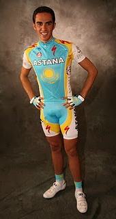
Actually, we like the basic design and reckon it’s certainly better than last year; it’s simple, bright, and clean, the logos less confused (and illegible). I’m a fan of white sleeves and white socks (not so much white shorts though).
Most folk agree that a design built on top of a base colour or two at the most is a good thing, and this kit ticks that box, but setting white next to yellow just looks meek, the colours bleed into each other.
Last year’s jersey was a mess of lines, fills, and accents – and did anyone else notice that there were always at least three different versions on the go at any one time (Lance of course was usually wearing a different version from the rest of the team).
A mistake this time round though was doing away with the navy blue shorts and introducing even more yellow.
Bert & Co. will be even more recognizable in the peloton, however, and that’s one of the main objectives of pro team kit, so fair play.
The new design incorporates the logos of new sponsors Samruk Kazyna and features the newly-signed bicycle supplier Specialized’s logo very prominently.
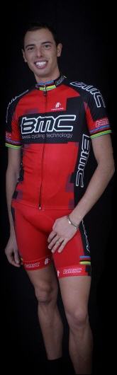
BMC
This kit is just announced, and I personally lament the move away from classy, understated black and white – especially if it’s Assos black and white. The simple and bold combination together with the black BMC bikes, made the team look, well, like a team coordinated, well prepared, and pretty mean.
This time around, the gear is provided by Hincapie Sportsware – no doubt a precondition to getting big George’s signature on the contract.
I can’t help feeling that my 13 year old nephew could have knocked this design up during playtime – like the Cofidis outfit, the red shorts just don’t work, and there’s little apparent detail involved.
Cadel will look fine in his rainbow stripes though, and I’ll wager he doesn’t have all-red shorts which would look horrid.
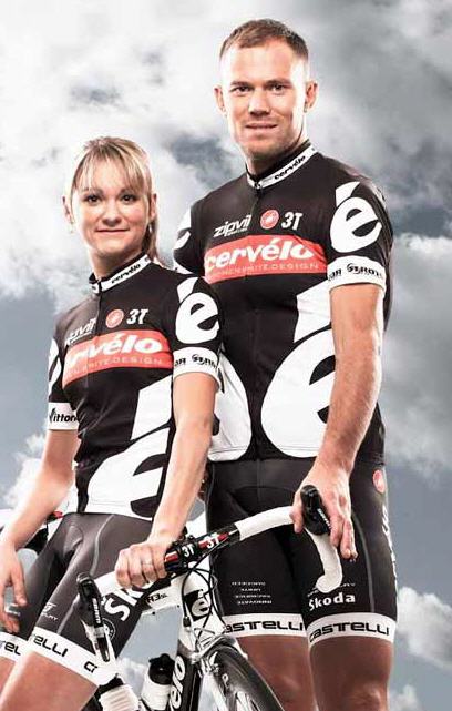
Cervélo Test Team
Like last year, it’s back to black for the start of the season; classic, easy to spot in the bunch, bold, and clear.
We reckon it’s pretty cool.
Gerard Vroomen reckons that the black kits make the team very visible on tv and from the team car, unlike all the blue kitted teams which all look the same.
Cervélo have retained the large é character as the main design feature, and it’s even bigger this year.
A simple design it may be, with the classic bar across the chest, harking back to the bike industry teams of yesteryear, but makers Castelli have gone a lot: further than simply producing cosmetic changes, making over: 60 refinements to the clothing, they say.
Footon – Servetto – Fuji
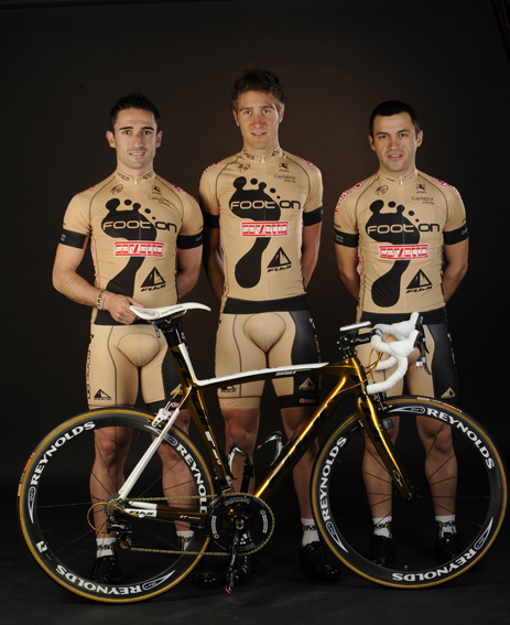
Old Mauro Gianetti presented his team to the world on Sunday, and it was, er, unusual.
Juan Mari Guajardo, the speaker at the Vuelta opened proceedings, introducing a short film in which a fictional chase scene depicted robbers stealing a valuable package from somewhere in Santander, chased by Dani Sordo in his rally car (he was second in the World Rally Champs last year).
The film finished with the thieves rolling up in their van to the hotel where the presentation was happening, then fiction turned into reality as men shrouded in black plastic capes, took the haul from the van which was at the back of the room and carried it to the front, and opening it up – the hot kit turned out to be the team’s bikes; Fuji SST1.0’s. The capes were flung off, and the thieves were revealed as the Fuji riders – resplendant in their new kit, designed by a chap called Dario Urzay.
Apparently, several years ago Urzay was commissioned to design the new shirt for the Athletic Club de Bilbao football team, and came up with a red lava lamp-type mish mash, after which he received a number of death threats! We’re still not sure if he’s a professional designer, or one of the rider’s cousins who “enjoys doodling”, but we sure hope Mauro didn’t have to pay for this howler.
Officially, the colour scheme is described as gold and black, but too bad for the riders the gold seems much closer in the photos to, how to say this politely, skintone.
Together with the main motif on the jersey – a large, black footprint – it’s easy to imagine an escaped gorilla discovering the riders cycling along naked and, outraged, giving them a damn good kicking. The red Servetto logo bunged across the abdomen like an afterthought resembles a rogue baggage label from an old suitcase.
Remember how Cipollini used to get fined for turning up in non-regulation team kit? Wonder if the UCI will pay these riders not to wear the standard issue.
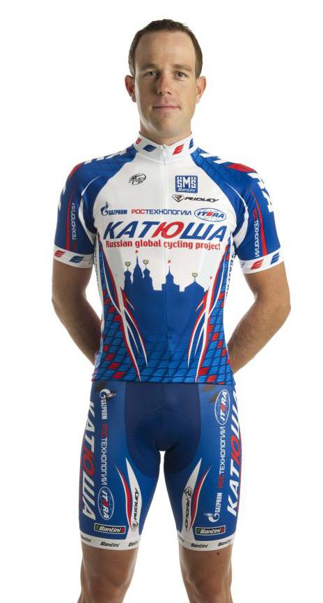
Katusha
Next up is the Ruskies. No big deal here though – the kit wasn’t that great last year – Pozzato’s blinding white Champion of Italy versions excepted – and it hasn’t really changed for 2010, except for having a bit more blue on the sleeves. Move along now, nothing to see here.
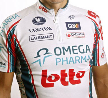
Omega Pharma – Lotto
I actually like this kit – it’s a break away from last year’s red/purple/black/lilac scheme, it’s centered around a single base colour, there’s detail in the Omega-coloured accents, but they don’t get in the way at all. Nice.
Quick Step
Quick Step’s new kit is what we’d call “retro cool”.
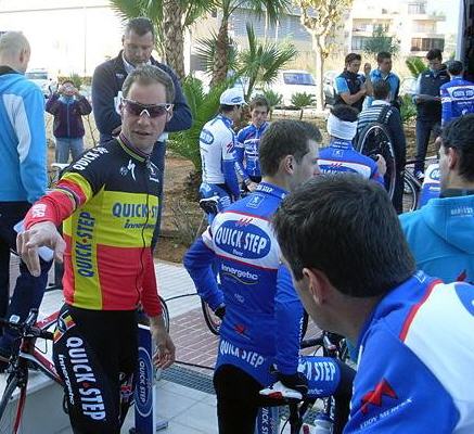
It’s not exactly new since they rocked up to the start at the Ronde last year wanting to wear it, but the UCI commisaires present told them they couldn’t race in them.
We’re pleased that this design wasn’t heaved into the bin then, and instead it will be the official kit this season.
Tom’s Belgian Champ’s kit is pure class, and follows the unwritten dress code of the connoisseur – national champion’s jersey, without too many sponsors logos, worn with black shorts.
The only thing that cold improve the kit would be the abandonment of the now-standard coloured shorts in favour of plain black.
Nevertheless, it’s already a classic.
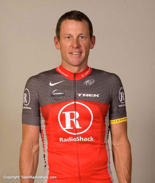
RadioShack
Lance of course had to be the one to model the new team’s jersey which to me looks a bit like a strapless dress, or even an ugly, ill-fitting pyjama top.
The colour-change at nipple-height makes it appear from a distance a bit like a boob-tube, and he does like his grey-on-grey designs (last using them on a limited edition USPS design in the 90’s).
This is one design that will definitely be changing as the season goes on, and we reckon it won’t look anything like this come July.
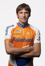
Rabobank
Oops, sorry, this one snuck into the piece accidentally – Rabobank haven’t changed a thing for the best part of 14 years.
Team Sky
We covered the no-expense spared launch of Team Sky in London last week, and it was truly a triumph of color coordination; team Volvo bus and Jaguar cars with blue grilles and trim parked up in front of blue columns, beautiful Pinarello Dogma bikes in with blue accents, the bosses wearing suits and blue ties,: and cycling shoes with blue soles. Sky is classy, cool and styled.
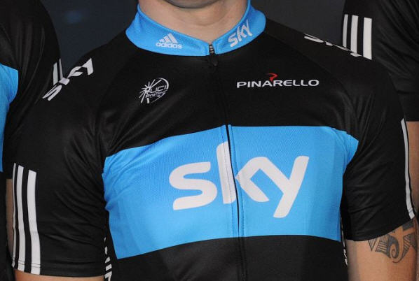
But, we aren’t sure the kit is as good as it could have been – hands up who thought the jersey would actually be the opposite of what we’ve got? We were expecting a modern, dynamic take on the track team’s design (created digitally? Sort of).
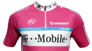
The front of the Team Sky kit is basically a change of colour from the old ’07 T-Mobile design – the Adidas factor I suppose. The understated design is really pretty dull, and T-Mobile got away with it purely on the strength of the base colour. That said, compared to some, the simplicity and lack of clutter is welcome, eh Snr. Savio?
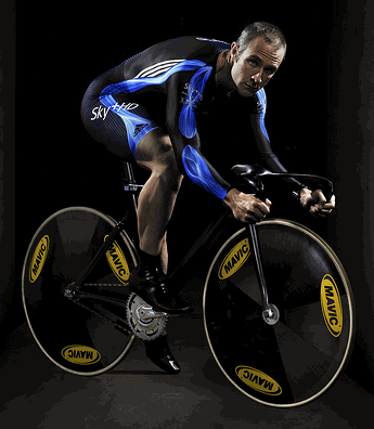
The jersey sides have the name and national flag of the rider, which is a unique touch I guess.
Looking at the back of the jersey, it’s somewhat detached from the rest. First of all, it’s just a big lightbulb-shaped splodge of white, then the title sponsor is represented with a tiny logo, and there’s that inch-wide full-length blue stripe running down the centreline.
I can only think that extensive tests, trials, and simulations demonstrate that this colourway and pattern stands out in the peloton to the DS following in the car better than anything else.
Wonder if they are going to do what Cervélo did last year, and keep schtum until the Tour de France is around the corner (or, until plenty of people have bought the replica kit) about a change of colours, to a design with a white base, a black chest stripe and a blue Sky logo?
And you know what? There’s probably a whole lot more of these presentations to come…
Garmin – Transitions
You just know that somewhere, someone is thinking to themselves;
“We really should be thinking about how we can represent ‘Transitions’ with a colour fade, maybe from light blue to orange? That would be really neat.”
Columbia – HTC
Following on from last season’s spectacular success in the “winning races dressed as Lego” classification, we wonder if the kit will or can actually get any worse? Judging by the recent pics from the team’s Mallorcan training camp, there’s perhaps not many plans in the pipeline.
There’s a reason that lots of people bought last season’s Cervélo Test Team kit – and it’s because it was actually wearable by you and me out on our bikes, without losing brand identity. Why don’t more teams think like that?
Your turn…
Let us know which kit design you consider to be the fashion faux-pas of the season! If Footon don’t win, er… lose, we’ll be amazed!